My Work
|
|
I was tasked with putting together a video presentation that displayed a brief history of Rhema Christian Center Church. I was provided with digitized VHS footage of various Sunday services and other church events. I made adjustments to the footage so that it would fit a 16:9 format, corrected audio syncing issues, and added titles and graphics. I was given a list of types of footage to include (sermons, choir selections, special services), and from there, I pieced the clips together chronologically. My goal was to include clips that not only fit chronologically but also highlight key ideas that the church was founded on. I also looked for ways to connect the past to the present in order to make the video more cohesive.
|
|
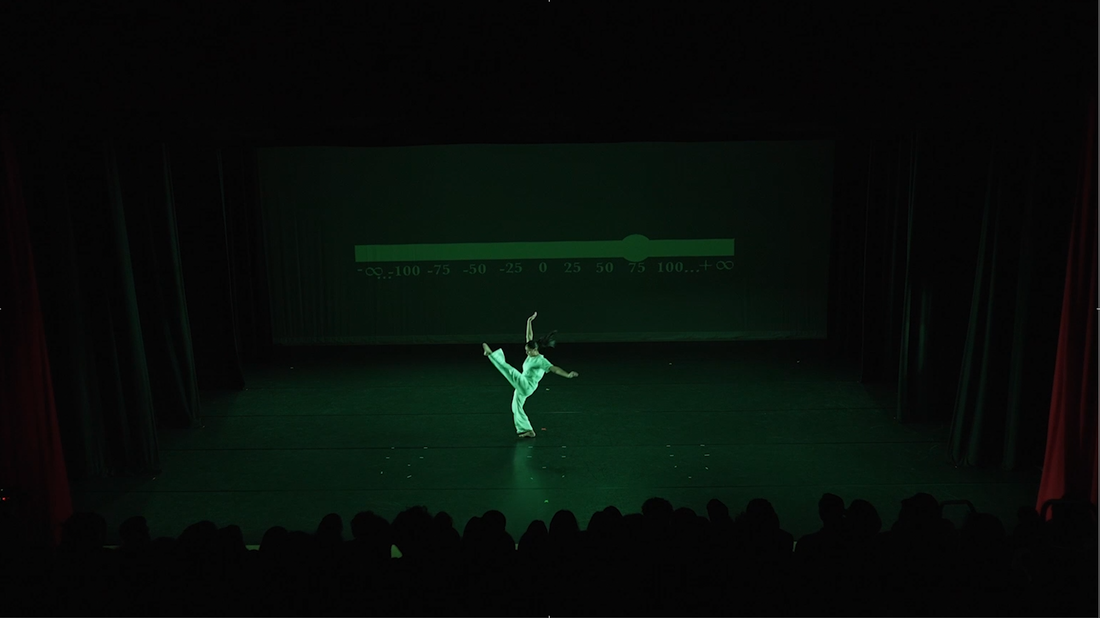
The Spectrum is a dance performance created by Gaya Shechter. I was asked to edit the live recording of the performance. I was given the multicam footage and audio. I pulled from my dance background while editing this performance. I made my editing decisions not only according to what worked technically but also what worked artistically. I chose which angle to cut to based on what displayed the dancers' movements most impactfully. Shifts in the music were also taken into account in my editing decisions.
|
|
|
Time To Go a short film that I wrote, co-directed, and co-edited (in Adobe Premiere). This short film is a drama about a young photographer who is trying to hold his siblings together as budding careers and romantic relationships threaten to ruin what is left of his broken family. I created the title sequence myself using Adobe Illustrator and After Effects. The three distinct sections of the title are meant to represent the three siblings. I was also responsible for casting and scheduling shoots.
|
|
|
For this project, I was tasked with telling a short story through the use of still images. The video had to convey the narrative as if the first sentence was "I wish he/she/they had remembered" and the last sentence was "Never to be seen again."
|
|
I worked with a small team to create an unofficial commercial for the Ball Corporation. Commercials are not always shown in their entirety so we were tasked with creating three versions: the 90 second, 60 second, and 30 second version. We were asked to advertise our client's product, that being the Ball mason jar, in a way that appealed to a variety of age groups but also had an old-fashioned feel to it.
|
|
Listen from Stacie McDowell on Vimeo. |
This is a supernatural horror film that I co-edited. The film is meant to be a social commentary on the abuse that some face as they pursue their dreams. The film was inspired by Suspiria(1977) and Whiplash(2014) Suspiria specifically influenced the color grading as intense red lighting was used to convey the dream like atmosphere associated with supernatural activity.
|
|
I was tasked with creating an animation that would function as a loop. I chose the more challenging method of creating the animation frame by frame which gave it a more antiquated feel.
|
|
For this project, I was tasked with filming a one minute video. I recorded a static shot and used the in-camera audio. In order to make the video interesting, I decided to record an argument between two people where only their hands are in frame and you do not hear what is being said. I set the focus on the hands of the two people because body language can be just as important as words when it comes to communication.
|
|
This is a Hitrecord video. My class had three themes to choose from for our video. They were "out of place," "taking a risk," and, the theme I went with," dreams." The majority, if not all, of our footage and music was supposed to come from the Hitrecord website. The only part that we had to record ourselves was the voiceover, which had to in some way relate to the video. I wrote my own poem and recorded my own voice for the voiceover. I made use of the dream effect in Final Cut Pro to give it a surreal feel.
|
|
I was in the International Baccalaureate Program in high school. One pf the requirements of the program is to write the Extended Essay, a research paper where the student chose their own topic to write about. For my paper, I analyzed the use of color in the films The Wizard of Oz and The Matrix. I researched what concepts and ideas were associated with certain colors and how the use of those colors influenced a person's emotions and interpretations.
| ||
|
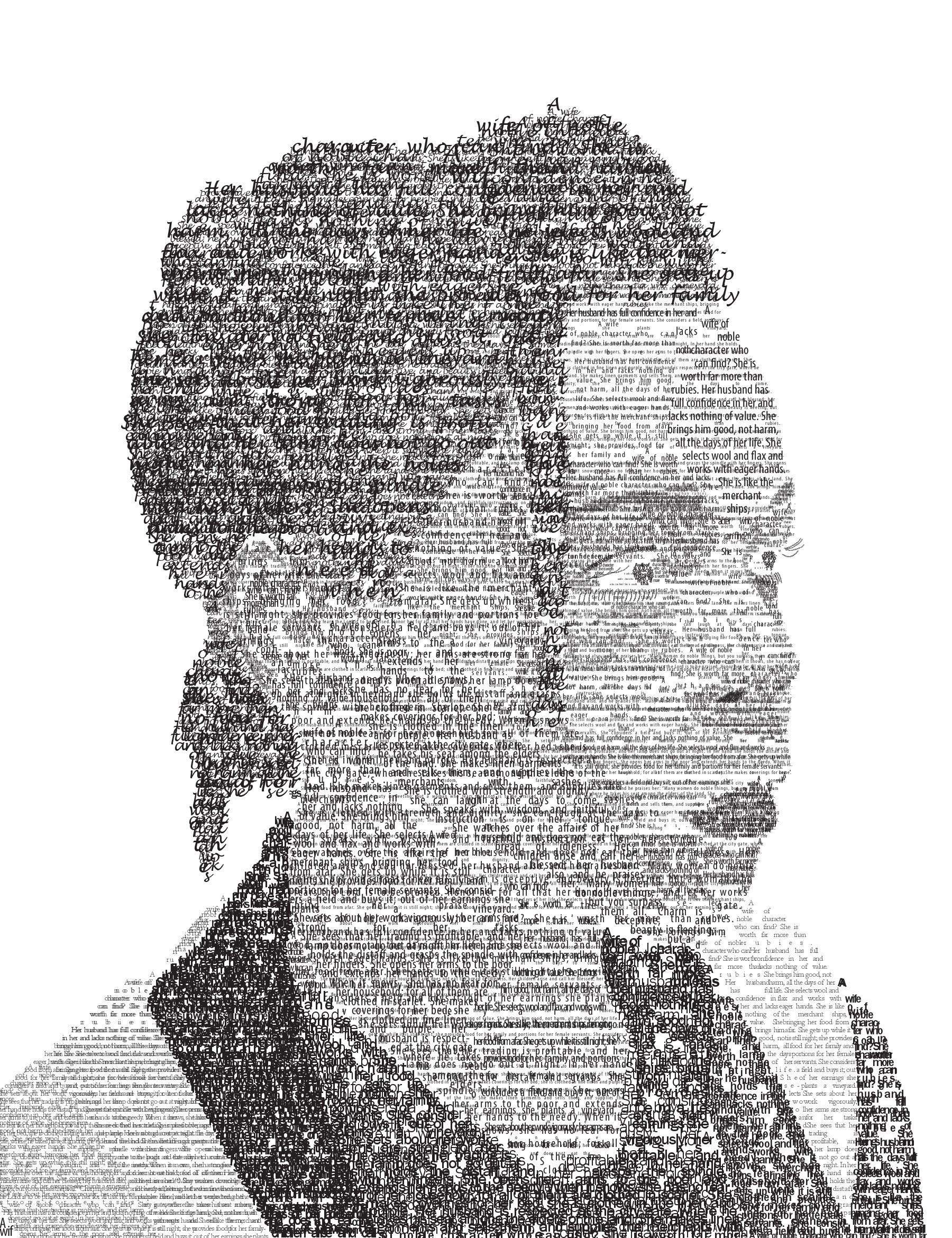
For a typography project, I created a portrait of myself using only text. I used Proverbs 31:10-31. My choice of typeface and how many layers of it I used was based on what feature of the image I wanted to mimic. For example, I used a typeface that caused the letters to have exaggerated curves to mimic the curliness of my hair.
| ||
|
This is another typography project I did where I was given a quote that I had to design so that it had different connotative meanings. (In order) I formed the quoted so that it came across as happy, humble, angry, arrogant, sarcastic, and sad.
| ||
|
SelfPortrait from Stacie McDowell on Vimeo. |
I was tasked with creating a self-portrait in video form. I had to figure out how to present my personality to the audience without simply providing facts and information. I chose to represent myself based on my oddest qualities. Each scene displayed an unusual habit I have. I chose to show the behavior of other people as well so that my differences would be obvious to the audience.
|
